
")


This post contains affiliate links. As an Amazon Affiliate, I earn from qualifying purchases. I may receive a small commission – no extra cost to you – when you make a purchase through these links.
Ready to learn how to design a professional-looking door hanger template from scratch? I’m walking you through my entire process! Let me show you exactly how I make design decisions, balance lettering, and create templates that make your projects easier. Watch the full tutorial in the video, or catch the notes in this post below!
My Procreate Setup
First things first, you’ll need an iPad and the Procreate App.
I recently upgraded to a new iPad Pro after my 2017 model finally started slowing down. That’s seven years of daily use, friend! These devices are workhorses.
Aside from my iPad, I also use the Procreate app (only $14.99 in the App Store, and a one-time purchase with no subscription fees). Compare that to expensive design software and you’ll see why I love it.
Step #1: Set Up Your Canvas
I always work with 2400 x 3200 pixels. Bigger canvases mean:
- Crisp, clean lines when you print
- Flexibility to resize without losing quality
- Professional results every time
For every element you add, you’ll want to create a new layer — for each word, each design element…everything!
When you do this, you can:
- Move individual words without touching others
- Adjust transparency for easy tracing
- Delete mistakes without starting over
- Experiment without worrying about messing the entire design up
Think of layers like transparent sheets stacked on top of each other — each one independent but working together to create your final design.
Step #2: Designing Your Layout
In this tutorial, I used a round door hanger design. However, you can take the tips and apply them to nearly any design with a little bit of tweaking!
For our round door hanger, I’m starting with:
- A circle drawn with the monoline brush
- Holding my stroke until Procreate offers “Circle”
- Adding a vertical line to split the design
This keeps everything outlined and separated for when it’s time to start on the more detailed design work!
Step #3: Add Your Hand Lettering
Here’s something that surprises people…when I create hand-lettered designs on my iPad, I don’t start with the first word and work my way down.
Instead, I:
- Find the longest word (here, it’s “season”)
- Letter that one first
- Build everything else around it
Why? If you start small at the top, you might run out of room for longer words at the bottom. By tackling the biggest challenge first, everything else falls into place much easier!
The Refine-and-Repeat Process
I typically redraw my lettering 3-4 times minimum. You don’t want to get too stuck on the details that you never move on to the next step. But if that doesn’t sound like enough tries, don’t worry. It gets faster with practice!
Here’s my workflow:
- First pass/quick rough draft — don’t overthink it
- Turn the opacity down to 30% so you can see through it
- Add a new layer and trace over with improvements
- Delete the original
- Repeat until it feels right
Each round, I’m refining spacing, size, and overall balance. It’s like editing a draft — each version gets stronger.
Smart Letter Choices That Save Space
This is where design gets practical. The exact same letter can take up different amounts of space depending on how you draw it. That’s why you need to be intentional about the shape of your letters.
For example, a lowercase “s” with a loop at the top pushes the next letter further away. But an “s” with a rounded top lets letters nestle closer together and can save you some space in the design.
Letters That Play Well Together
Watch for natural “tuck-in” spots:
- An “H” can sit nicely under a “T”
- Extending the tail of an “S” fills awkward gaps
- Mixing capital and lowercase creates an interesting rhythm
Overall, choose your letter style based on what fits best, not just what looks prettiest as a standalone letter. This is where good design becomes smart design.
Creating Balance with Bounce Lettering
Bounce lettering means your letters don’t all sit on a straight line — they vary in height and position and make the design both visually appealing and easier to create (you can see an example here!).
Guidelines that help you create bounce lettering:
- Balance big letters at the beginning and end
- Avoid tiny letters sandwiched between giant ones
- Step back and trust your eyes. Sometimes creating a little distance helps you better see the big picture of the design (instead of focusing on the tiny details).
Additional Lettering Tips
You already know more about design than you realize. When you’re decorating a room or choosing an outfit, you can tell when something’s off, right?
Apply that same instinct to lettering:
- Does something feel crowded? Adjust the spacing.
- Does one word dominate too much? Scale it down.
- Does it look lopsided? Shift elements around!
Your eye knows. Trust it!
Step #4: Adding Pattern Elements
Creating matching shapes on both sides is tricky to draw freehand. Save yourself the struggle:
- Draw half of your pattern
- Duplicate that layer
- Flip it horizontally
- Line up the halves
Perfect symmetry without the headache! And once you have a design you like, you can repeat those 4 steps to create the entire pattern.
PRO TIP: Select multiple layers at once (swipe right on each) to move or resize your whole pattern together.
Filling Those Awkward Empty Spots
Empty space can make designs feel unfinished. Easy fixes:
- Tuck in small decorative leaves
- Add dots or swirls
- Let elements extend off the edge slightly
- Remember that textured paint backgrounds help too
Step #5: Testing Color Combinations
This is where Procreate really shines! To test colors:
- Create a layer below your line art
- Use the airbrush tool to fill areas
- Toggle layers on and off to compare
I tested sage green with cream pumpkins, rust with colonial blue, and tan with orange — all in minutes!
Step #6: Creating Your Printable Template
Once you’re happy with your design:
- Flatten all layers (pinch them together)
- Export as JPEG: Actions > Share > JPEG
- Also save as PNG for the highest quality
Quick guide to file types:
- JPEG: Standard image, works everywhere
- PNG: Better quality, supports transparent backgrounds
- PDF: Crispest lines for printing
Then, you can use blockposters.com (completely free!) to create a poster-sized version of your template.
You’ll probably print 2-3 versions before getting the perfect size. That’s completely normal—I still do this! Don’t get discouraged. Each attempt teaches you something new about the process!
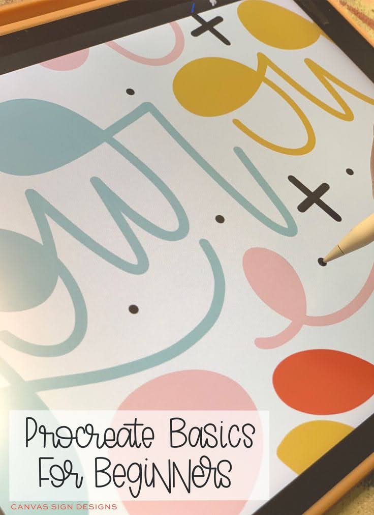
Ready to Master the Procreate App?
You just experienced firsthand how helpful Procreate can be for creating door hanger templates. But this tutorial is just scratching the surface of what you can do with this app!
If you’re feeling a little overwhelmed by all the features, or you know Procreate could be a game-changer for how you create, I made something specifically for you.
The Procreate Basics for Beginners Course breaks down everything you need to know into small, easy-to-follow lessons! No more guessing which tools to use or feeling frustrated when something doesn’t work the way you expected.
Inside the course, you’ll master:
- How to Use Layers like a pro (so you can edit without starting over)
- Creating and Editing Text for unlimited design possibilities
- Brush techniques that make your lettering look professional
- Selection tools that speed up your workflow
- Saving and exporting in the right formats every time
This is self-paced and pre-recorded, so you can learn on your schedule — whether that’s late at night after the kids are in bed or during your lunch break.
Sound like the thing you need? Grab the course here!

